|
Creating a look for your sign involves font choices, design elements, sizing and color.Size will also be an important aspect to consider when designing your signs. Will your signs be closer to the road? If so, this may allow you to get away with the use of smaller signs to help out with the budget. Although, if your advertising/promotion area is busy, you may decide to go with a slightly larger or billboard style sign. Also sizing of graphics on your sizing is important. As stated before, the most important feature on your signs is your name. Try to make it standout with a larger font.
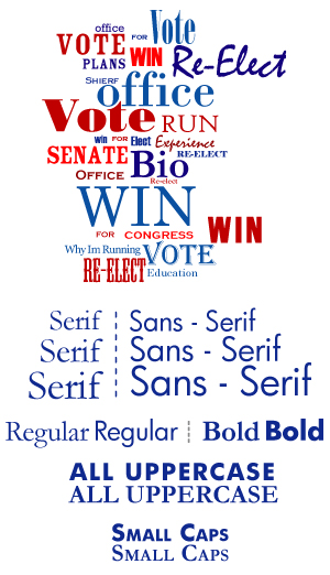
Having a distinct font type that creates a strong name ID with all of your campaign materials is an effective tool for increasing your name recognition. The font you choose is important in regards to style and readability. Clean strong fonts include Impact, Rockwell, Arial, Copperplate, Times New Roman, Garamond, etc.
Design elements are attractive and can be fun to have on your signs, but like all things, a little goes a long way. You don’t want to overpower the message of your signs with a lot of graphics and clip art. Remember the most important feature on your signs is your name.
|